Category Archives: Tips & Tricks

From Russia With Menace

This post is perhaps a bit left-field for Cthulhu Reborn, but I figure that if there’s one thing that every reader of this blog wouldn’t mind hearing more about … it’s free stuff that can potentially be useful in enhancing Lovecraftian tabletop RPG sessions.

So, in the spirit of sharing links to (potentially) useful freebie things, I’m going to talk for a bit about a source for limitless FREE (and good) Dark Ambient music. Now I know the idea of using spooky or atmospheric music to “set the tone” for a gaming session is certainly nothing new. I have read lots of posts on forums over the years with recommendations for movie soundtracks and the like which would make great backdrops to a Cthulhu game gathering. Heck, there have even been a few commercial CDs specifically put out to accompany Call of Cthulhu and Trail of Cthulhu books.

Over the years I’ve tracked down loads of excellent CDs and MP3s from artists in the curious musical sub-genre called “Dark Ambient” — it’s that sort of intersection of minimalistic background sounds with drony hypnotic sounds and general disturbing spookiness. I was even remarkably fortunate enough last year to see one of the geniuses of this style of music — Lustmord — perform live [here’s a snippet of his live show on YouTube].

Anyway … up until recently, my collection of Dark Ambient music has been limited to what I could easily track down (and buy). But then, by chance I stumbled upon the existence of an incredible resource: a net-label called “GV Sound”. Now a net-label, for those who haven’t run into one before, is a kind of record label that exists only online and (usually) releases stuff for free. They are usually themed around a musical style or collection of styles, and the label adds value by only releasing things that are .. well up to their standards. So, grabbing music from one of these labels is much less hit-or-miss than just randomly downloading an MP3 released independently by “some random guy or girl”. But it’s still free music.

I don’t really know much about the “GV Sound” net-label except what it says on their website: “GV Sound Netlabel is open to Dark Ambient, Drone, Noise, Ambient Music.
We provide free distribution of independent Music under Creative Commons License with free dowloads.” The label seems to be based in either Russia or Ukraine, and a lot of the music it releases also seems to come from that part of the world, and has been releasing free music at a rapdily-increasing pace since 2011. At the time I write this they’ve clocked up 294 releases totalling over 2200 files (a little of 11 DAYS of music, of varying types of darkish ambientness).

If this sounds like your sort of thing, I would very much suggest scooting over to the Internet Archive (archive.org) which collects most of the GV Sound releases on this page. You can download ZIP versions of entire albums, or listen to the music online using an in-browser player supplied by archive.org. If you just want to a quick sample of what this is about, maybe this page would give you a taste of what this label is all about. The same music is also available on other music sharing sites like Bandcamp. I’ve listened to just a fraction of what’s available for free … but I’m very impressed with the general quality. Releases vary in style across everything from pure drones to spooky piano pieces to noisy and disturbing soundscapes. Lots of it could be suitable for use in Lovecraftian games. Some of the track titles (at least the ones that aren’t in Cyrillic letters) seem to hint at Cthulhu-related inspiration to some of the music, too.

One of the more remarkable of the GV Sound releases was a compilation of different forms of Ambient music they put out to celebrate the numerologically signiciant date 11 November 2011 (11/11/11). This compilation runs for … well 24 hours, covering the entire day in 11 minute chunks. The “Light Side” half consists of 56 tracks and the “Night Side” half has 70. Quite an achievement.

On a related (but not quite freebie) note … I should also give a mention to another Cthulhu-related ambient musical artist, who has also released some great music intended to be either a background soundtrack to Lovecraftian games or just music to listen to while you read HPL’s fiction. The music is released under the name Seesar, and here’s a link to my favourite of his (their?) releases on Bandcamp.

So … I guess there’s no reason NOT to try to scare the bejeebus out of your players next time you gather together (in a darkened room) to roll the dice to save the world from the Great Old Ones. Save it for another week, anyway 🙂


Making Brand New Antiques

The other day I promised to provide a few hints about projects that Cthulhu Reborn has been working on for different Call of Cthulhu publishers … and in a few days I hope to be able to provide a bunch of information about something special that I have been working on for Sixtystone, that is veeeeery close to being ready to go. The great thing about that project is that not only have I done some funky work on character sheet design … but Sixtystone have also trusted me to completely design the look of the book, create the layout and provide most of the art! Watch this space for more soon!

In the meantime, though, I thought I would talk a bit about something altogether different … I am working on a project for Chaosium (as yet unannounced, so I can’t say too much) that involves creating a mountain of prop documents with a “1920s Arkham, MA” feel to them. Readers of this blog will know that I’ve done lots of period props before … but the sheer scale of this particular job was quite astounding. Below is an example of the kind of thing that I have created.

New Antique Tut - 7 - Final

Doing a lot of this type of work in a short time frame has been quite an interesting experience, and it has really honed my skills at … well, at making brand new things that look like they are really old. Over time I have developed quite a selection of techniques for using digital tools — designed to make crisp and precise artworks — to make things that are not at all crisp or precise. I thought that folks might be interested in seeing how different techniques can come together to make something like the example above look old … so here’s a quick run-through of how I approach creating designs like this.

Although the techniques I mention below make particular reference to features in Adobe Illustrator (my tool of choice), I’m sure that most if not all of them are also available in other drawing packages. BTW: for all images shown on this page, you can click to see larger versions.

The first key design decision for prop documents is the choice of fonts … its usually pretty easy to find fonts that look vaguely period-specific, even using free fonts or the standard set that comes with modern Operating Systems. Usually I try to find a period-specific referemce image of the type of prop I’m designing, then pick fonts that are “close enough”. Here’s the “Burial or Removal Permit” prop in its raw form — just a bunch of text formatted with some vaguely 1920s-looking fonts:

New Antique Tut - 1 - PreTrackingWhile that already looks pretty reasonable, there are a few things that stop it looking truly vintage. One of the first things I like to do is to tweak the inter-character spacing in text (technically called the “tracking”) of the text. Modern fonts and computer typesetting seems to usually create text where the letters are quite tightly spaced, but old hand-set type was much, much looser — doubtless there’s some historical reason for this. Once you’re used to looking at true vintage typography, samples spaced in a “modern” way just jump out at you as non-authentic. Fortunately, modern drawing and typesetting tools give you a fair amount of control over a number of parameters (including tracking), so you can tweak away to create that wider-spaced look. Here’s a screenshot of Adobe Illustrator’s way of doing this:

New Antique Tut - 1a - Set Tracking

And here’s what our sample looks like with some wider character spacing for most of the text:

New Antique Tut - 2 - PreStrokeTo my eyes, this is already starting to look more like an old document. The next thing to address, though, is the crispness of the lettering — most fonts (and typesetting software) aim to create things that look crisp, but here we want something that looks a bit rough around the edges. One easy way we can make things look less crisp is by adding a stroke (basically a line) to the outside of the text. Adobe Illustrator lets you pick the width of the stroke as well as its colour, so you can achieve several different degrees of de-crisping:

New Antique Tut - 2a - Add Stroke

And here’s our prop with thin black outline strokes added to all the lettering.

New Antique Tut - 3 - PreRoughenSee how that beautiful crispness of the original typeset text has been grunged up a little? But we can go even further … Old typesetting methods were pretty error-prone: real-world offset type would pick up ink unevenly and if there was dust or other grime around the place it was pretty easy for lots of randomness to creep into the outline of letters. If you don’t believe me, go look at some scans of 1920s newspapers! Adobe Illustrator has a nifty way of similarly adding randomness to shapes — and thankfully also to lettering — by means of its “roughen” filter. This basically divides up a shape or letter outline into lots of small segments and randomly perturbs each one by an amount within a range you specify. Here’s how you can use it to add some randomness to our text:

New Antique Tut - 3a - Add Roughen

And here’s what the prop looks like with everything grunged up just a bit. This effect can easily go overboard, so it’s important to show some restraint (otherwise the text can get entirely unreadable) — here I am telling Illustrator that it can only perturb the outline of text by at most 0.1mm but that it can randomly shunt things around 79 spots per inch around the perimeter of the letter.

New Antique Tut - 4 - PreOpacityThe next thing I usually do to make text seem even more “indistinct” (in a vintage printing kind of way) is to give it a variable level of opacity to model the differing amounts of ink that were picked up by different parts of the type. While some letters will have picked up a whole bunch of ink, dust and grime will have caused other letters to pick up less than they should, and in extreme cases maybe left part of the letter entirely free of ink. We can digitally do something similar using my all-time favourite feature of Adobe Illustrator — the Opacity Mask. You can read detailed descriptions of what these are elsewhere I’m sure … but effectively Opacity Masks let you specify how see-through an object should be at different points across its surface by providing ANOTHER monochrome bitmap or shape (the mask). Wherever the mask is white, the original image will show through perfectly; where it’s grey it will show through partially, and where the mask is black the source image won’t be visible at all. When your mask looks like this:

New Antique Tut - 4a - Opacity Stress

you can create a subtle effect which makes you subconsciously see grimy old type instead of nice, new computer typeset type. You put the mask on top of the text you want to make grungy, select the two and tell Illustrator to go:

New Antique Tut - 4b - Make Opacity Mask

Here’s the result for our prop — it’s pretty subtle, but quite effective.

New Antique Tut - 5 - PreGlowThere’s still another way in which we can try to emulate some of the grungy effects of real-world printing. Depending on the type of paper being used, real-world samples tend to bleed a little bit around the edges (this happens even with inkjet printers a bit) — that makes the edges seem sort of a bit blurry or faded. We can model this using an “outer glow” effect in digital drawing tools. Here’s the same prop but with a small amount of black outer glow added to all text:

New Antique Tut - 6 - PrePaperNotice how this makes everything seem just slightly blurry … but in a way which looks like something printed a long time ago. Finally, we can add in some realistic paper texture to make things looks like a real-world document:

New Antique Tut - 7 - FinalWhen adding paper, I have found it is usually a good idea to make the text ever-so-slightly transparent (maybe setting opacity at 90%). That way, some of the paper texture still shows through even in the printed parts, and it generally looks more like a printed document instead of a piece of paper with some text perched in front of it.

And that’s our prop … I hope this brief tutorial walk-through of the vintage prop creation process is helpful or instructive to other designers and artists out there. I have used all of these techniques (sometimes separately, sometimes together) to create a LOT of different period props — when it works, they can look very convincing indeed! At least to my eyes . . .


Font of All Madness

Recently, over on the Yog-sothoth.com forums someone asked an interesting question relating to hand-written props for a Call of Cthulhu game. In a nutshell: how do you create large hand-written documents where the writer’s slow descent-into-madness is evidenced through the qualities of his or her handwriting?

The most obvious way is to create such a thing manually, but this has some drawbacks (very time-consuming, limited to your own handwriting style, etc). Using one of the many “realistic handwriting fonts” that are readily available commercially or for free seems like an enticing alternative … but how do you go about the process of deteriorating the quality of the writing as the fictitious writer goes slowly mad?

The proper solution to this problem would be for someone to invent a family of fonts which captured the same glyph-shapes under different types of stress. But that sounds like a lot of work to create, and (to my knowledge) nobody has ever put that much time into this rather specific problem.

I’m certainly nowhere near skilled enough to create fonts like that … but I do have some knowledge of using modern font-editing programs to warp and modify existing fonts. So, as a quick-and-dirty pseudo “solution” to this problem I thought I would have a go at taking an existing (freeware) font and seeing what could be done to distort the glyphs in a way that suggested first mild emotional stress, then modest madness, then full-blown insanity.

The Experiment

Before I got to creating insane handwriting, I needed a “sane-looking” font which represented the writer in a normal (sane and emotionally-balanced) state. I cruised over to dafont.com and found an excellent free handwriting font called PhontPhreak’s Handwriting. I used two variants of this font to represent “normality” — the first is a fully-upright version.

Font of All Madness - Journal Sample 1and the second is a slanted version.

Font of All Madness - Journal Sample 2[Click images for larger versions]

Slanted handwriting always suggests (to me, anyway) a degree of urgency … like the writer is under some kind of pressure. So I thought that could represent a base-line of emotional duress from which to begin a descent into fonty madness.

Now, there are obviously many ways to convey insanity through writing in a prop. The mental conflict of the writer might make them angry or desperate, which might be conveyed through heavier strokes and bolder letters. Equally, the stresses of encountering something terrible might make someone nervous and frail, which could be suggested through a lighter more wispish handwriting. In order to allow for either option, I started off by making a lighter and heavier version of the slanted font.

Font of All Madness - Journal Samples 3+4[Click image for a larger version]

These I figure might be useful (in isolation or together with the base font) to document the earliest steps down the road to madness.

Armed with these I started playing around with manipulating the shapes of the letters. I did this in two main ways — firstly by warping the glyphs using a wavy-shaped envelope. That gives a kind of overall impression that the writer is struggling to make the normal letter shapes due to a “disturbed” state. The other distortion I tried involved adding in lots of extra points around the glyphs and randomly jittering them around. This gives a “shaky” effect, like the writers hand is unsteady. The samples below show what these look like for light, medium and heavy versions of the font. Most of the text is distorted by the “wave” effect; the bits circled in red are treated with the “shaky” effect, and the sections circled in purple have both effects applied.

Font of All Madness - Journal Samples 5+6+7[Click image for a larger version]

Each manipulation of the base font produces a new font in the broader “family” … so already by this stage there are over a dozen different but related fonts. Conceivably these could be mixed and matched in lots of different ways to make all sorts of different versions of the inevitably decline into drooling idiot.

One last thing I tried was to overlay a couple of these different variant glyph-shapes to create a “doubled-up” effect. Lots of fonts which aim to convey a “psycho killer” slash “Jack the Ripper” kind of vibe seem to obsess on the notion that a madman (or madwoman) would write the same letters multiple times on top of each other. Overlaying the earlier fonts kind of gives that effect. The samples below show this for the light, medium and heavy version of the font family.

Font of All Madness - Journal Samples 8+9+10[Click image for a larger version]

That’s where my experiment stopped … By the time all the different combinations of effects and weights had been multiplied out, I had created a family of sixteen variant fonts. Doubtless someone could extend this further, but for me I reckon that would give me a design arsenal to tackle lots of different props. Below is a contact sheet showing all the fonts, and below THAT some download links you can click to get the fonts themselves.

Font of All Madness - Contact Sheet[Click image for a larger version]

Downloads

The original font used as the basis of this experiment, PhontPhreak’s Handwriting can be downloaded from daFont.com and is free for personal OR commercial use. The variant fonts I have created can be downloaded as a ZIP file using the link below and are similarly free for personal or commercial use.

Download the Font of All Madness family (based on PhontPhreak’s Handwriting)

Download the journal sample in full, as a JPG


Anatomy of a Newspaper Prop

As most readers of Cthulhu Reborn would be well aware, I really like the idea of creating realistic-looking props to enhance the play of Lovecraftian roleplaying games (heck, I even published a product to make it easier for people to make nice-looking 1920s newspaper props for just this purpose).

The other day I had the enjoyable experience of running the most venerable and often played Call of Cthulhu scenario — The Haunting — for a brand new gamer. It was, as always, a lot of fun. But while running the game I realized that despite there being several places in the scenario which incorporate clues from newspapers, town records, and the like … none of them are provided in the book as props.

After I finished the game, I googled around to see if anyone had every thought to create such items — it turns out that back in 2008 (and again in 2010) some folks over on Yog-Sothoth.com took on the task of putting together some nifty newspaper handouts. The guilty parties were Greg Phillips, Andy Miller, Alicorn, Andrew Brehaut and Matt Wilson and you can grab a PDF of their cool designs from the vaults of Yog-Sothoth.com.

Now these are pretty neat designs which incorporate some interpretation of scenarios details to flesh out the scenario’s sketchy details (e.g., the scenario says the House is in Boston, but never gives a street address or even neighborhood). To be perfectly honest I would be more than happy to use these handouts when playing The Haunting next time … but while looking through them I couldn’t help but wonder whether some of the older newspapers couldn’t be made still *more* realistic with a bit of historical research and judicious art design.

Fast forward a day or so … and my own experiments to create a period-specific design for the very earliest of the newspaper clues (from a Boston newspaper, dated 1835) were complete. Here’s a photo of the end result, printed out on the cheapest and nastiest paper I could find.

Haunting1835-PrintedIf you’d like to get the PDF of this two-sided design, feel free to click the download link below and you will have it. As with Yog-Sothoth.com design upon which this is partially based, this version of the 1835 handout is released under a creative commons licence.

Download the two-sided 1835 newspaper handout prop for “The Haunting”

Designing the 1835 Newspaper Prop

Now, while posting this design here is perhaps of slight interest to folks planning on running “The Haunting” in future … I thought this would be a great opportunity to show step-by-step how such a design gets created from scratch, sharing some of the tips & tricks that I have learned from making dozens of such prop Newspaper designs. Creating beautiful period prop designs is actually less work than most people would imagine … it’s all about knowing where to look for good source examples and design elements, and knowing what techniques mimic period design and typesetting practices/technology.

[A small disclaimer: while I will step through all the steps to create the design shown above, I am not going to go step-by-step through everything in terms of particular options or features of drawing software. For the record, everything shown here was created in Adobe Illustrator … although probably could have also been done in PhotoShop with some judicious choices. The same features that I’ve used from these products are almost certainly available in other packages as well; but you’ll need to figure that out for yourself if you want to emulate this process]

Courtesy: Cisticola at DeviantART

Step 1: Research

The first step in making something that looks authentic to a period … is to find out what “authentic” means by finding an example or two. For newspapers this is remarkably easy these days. There are loads of archival scans of old newspaper issues, many of them available for free. My favourite place to go trawling is Google News archives — this (discontinued?) service archives over 2000 newspapers of US and Canadian origin, dating back to 1738.

For this project I was interested in finding a newspaper published as close as possible to 1835 in a place as close as possible to Boston. Without going through the gory details, I looked over several candidates before settling on the Rhode Island Republican (which Google archives from 1801 to 1841 with 50 issues from 1835). While I would have preferred a Boston paper rather than one published in Newport, the survey that I’d done convinced me that this would be a good representative anyway.

Click Images for Enlarged Versions (which show much more detail)

Haunting1835-RI Republican 1

The first points I noted when looking through some issues of the Rhode Island Republican were:

  • It’s very much a “wall of text” kind of layout, broken up by a few simple icon graphics but nothing more elaborate
  • It doesn’t really have big screaming headlines with bold fonts; indeed headlines are in the same font as the body, just slightly larger and bolder

Haunting1835-RI Republican 2

The sections towards the back of the (4-page) newspaper seem to hold the advertisements, as pictured above. These aren’t very elaborate from a typesetting perspective but seem to involve the only major difference in font: the drop caps used at the beginning of the advertisments depart somewhat from the otherwise boring and “sensible” typography, being more ornamental.

Step 2: Picking Fonts

One of the most important choices to be made when making these kinds of layouts is deciding on fonts to use. Ideally I try to pick things as close as possible to the source material, although that can sometimes be quite difficult. One tool I’ve found that helps is the website Identifont, which goes through an adaptive Q&A process to identify a font based on its combination of key features. Using this site I found a dozen or so named fonts that could serve as a representative of the body text — looking though my old font CDROMs I found that I had access to a version one of them: Scotch Text.

I followed a similar process on the ornamental drop caps in the advertisements (harder, since there are fewer letter samples — though Identifont has a special “limited characters” option that guides the search using only the letters available). It became obvious that these were some form of Bodoni font.

Haunting1835-Prop1
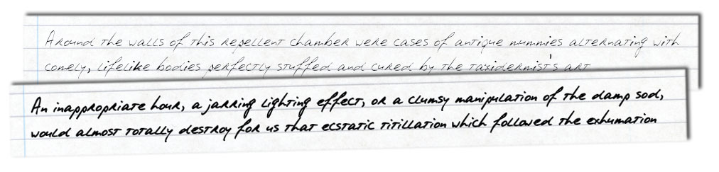
Armed with these fonts, it’s a simple matter to take the text from the Yog-Sothoth version of the handout and render them using these fonts (see above).

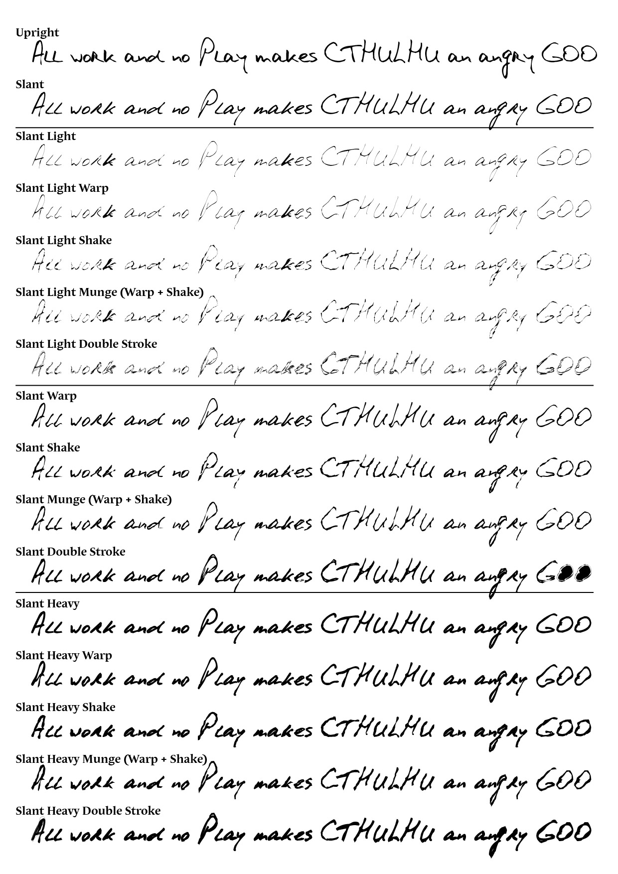
Now, even by itself that looks pretty good, but one thing that stands out is that the letters look very crisp … which isn’t surprising since that’s one of the goals of modern fontography and typesetting. But something more smudgy would look closer to the 1835 samples. I’ve found through experience that it’s possible to significantly reduce the crispness of text either through blurring (a fairly crude weapon) or by adding a stroke to the outside of the lettering.

The samples below show the same text with a 0.5pt or 0.75pt stroke applied to the text. As you can see, this makes the handout sample text look much less crisp.

Haunting1835-Prop2Step 3: Placing it in a Page

I always like wherever possible to put some “context” around a prop by typesetting other parts of the page (or book) that they came from. The Yog-Sothoth version of the 1835 newspaper already included a bunch of excellent “context” articles around the “WEBBER HOUSE SOLD” clue-text … so I though I would add those into the layout. But I also wanted to add some other items inspired from the Rhode Island Republican as well … like this advertisement for a “House to Let”.

Haunting1835-Prop3Placing the articles and advertisements into columns, it doesn’t take long before a full-page handout is constructed.

Haunting1835-Prop4Step 4: Creating a Reverse Side

For newspapers I think it’s always a nice touch to print clippings with some additional “context” detail on the reverse side. This is particularly useful when the prop is to be printed on low-grade paper like newsprint. In that case, the reverse side is often visible “bleeing through” indistinctly behind the main design. This gives a nicely authentic appearance.

After clipping the front side design to a rectangular region, I created a second “page” of the design to the right and copied that rectangular region (plus the vertical column lines) over onto that page. With a bit of care (or some basic maths) it’s pretty easy to position the reverse side material at exactly the location that will be behind the front-side of the design when printed in duplex.

Haunting1835-Prop5After filling in more news articles on the reverse side, I decided to stress the printed text and lines on both sides by introducing some grainy blotches which make small sections opaque. This simulates dust and other matter on the printing press that cause ink to be unevenly applied to paper, as well as worn-out metal type. I won’t go into the specific technique I use for this (since it’s specific to Adobe products — basically involving the Mezzotint filter and opacity masks), but any option that lets you knock out random or localised clustered sections would work ok. If you click the above sample to see it scaled up, you’ll see some of the grainy artifacts that this technique introduces.

Step 5: Adding a Paper Texture

Finally, I added some background texture by placing an image of some old paper behind the design and making all the text, lines and icon illustrations slightly transparent (multiply at 95% opacity works well). The end result looks like this:

Haunting1835-Prop6So, anyway, that’s my little experiment with making a newspaper prop from 1835 New England … I’m pretty happy with the result, but even more happy to share some “behind the scenes” info on how it was created. I hope that someone out there will find this info helpful to their own prop projects!


Coming in 2013: First Commercial Prop Resource

Welcome to 2013 … here’s hoping this will be a great year for Lovecraftian roleplaying in general — there certainly seem to be a bunch of cool projects waiting in the wings to come out this year, so fingers crossed.

For my own small part, I have a few plans in store for 2013 as well. The first one I would like to announce is that I am hoping in the not-too-distant-future to release the first commercial PDF under the Cthulhu Reborn name. “What’s that?”, you say, “I thought this site was here to put out free stuff for everyone to download and use!” Well, yes, that’s mainly what it’s for (and I’ll certainly continue to use it in that way — with several free things currently well in to their latter phases of development). But I thought I would experiment a bit with creating a commercial product — not so much to make mega-bucks (here’s a hint: nobody producing Lovecraftian RPGs makes mega-bucks) — but rather to investigate other channels for distributing stuff. If you feel miffed, I’m sorry.

Mutable Deceptions 1 - Front Cover (lo-res)

Anyway, the PDF that I’m planning to release for a modest fee later in the year is something I’ve been working on for a while. It’s a collection of PDF templates to ease the burden when it comes to creating prop newspaper clippings from the 1920s and 1930s. I’ve done a LOT of these for various people over the last couple of years (some are available here on the site as part of downloadable scenarios) — I’ve developed lots of little tips, techniques and templates that go a long way towards making news articles seem “realistic.” The idea of this product is to encapsulate as much of that expertise as possible, within the constraints of the PDF format,  into a pre-packaged product that you can use. The PDF template set will be called Mutable Deceptions.

Here’s a bit of a product blurb from the introduction of the PDF:

Period newspaper props and handouts are a much-treasured staple of most Investigative and Mystery roleplaying games, in particular Jazz Age horror games like Call of Cthulhu and Trail of Cthulhu. Players love the tactile thrill of receiving a well-crafted newspaper clipping, whether it be the clue which kicks off an investigation, the reward for hours of hard library research, or a piece of misdirection designed to send them off on a wild goose chase.

But making your own realistic-looking period newspaper clippings is not necessarily a quick and easy task. There are distinctive typographic styles, including font choice and layout conventions, which distinguish well-crafted period-authentic props from those which have been hastily-drafted using modern word processing software. And, in keeping with high standards of realism set by commercial products, such handouts should also incorporate evocative graphics in the form of realistic photographs or advertisements appearing on the reverse-side of the page.

So, what’s a Gamemaster/Keeper/Dungeon Master to do in situations where he or she wants to create an authentic-looking newspaper prop for a new scenario?,Or for a published scenario which lacks good-quality handouts? Or maybe a quick newspaper report mid-adventure recording the consequences of actions taken by the players? Or which leads them off on a tangent of their own devising?

Mutable Deceptions 1 - Arrangement (lo-res)

Mutable Deceptions, Volume 1 aims to make the process of creating realistic-looking newspaper props from 1920s and 1930s quick and easy. It does this by providing a selection of article templates, each a fillable PDF form. Included in this package are fourteen templates of varying shapes and sizes which can be effortlessly customised to create an endless array of 1920s/1930s-authentic props. Bring your own text, or manipulate the bizarre real-world stories already pre-filled into the forms.

As a bonus, a sampling of 1920s photos are provided for you to use as you like to embellish your handouts with just the right type of blurry, grainy illustration.

Baffle your players. Have them chasing shadows. It doesn’t get any easier than this.

Dispensing with the marketing-speak and atmospheric lighting … what the heck will this package look like? Well, it will be a collection of three PDFs — one being an instruction booklet, one being a 20 page booklet of templates in black & white, and the third being the same templates but with a faux aged paper texture rendered under the text you type. Rather than just giving you blank templates, I have scoured a bunch of old newspapers to find enough weird and wonderful articles — each of which seems like it could have been part of a Cthulhuoid investigation — and pre-filled them into the forms so you can see what the finished product might look like. So, when you open up the templates file in Acrobat Reader, it looks a bit like this:

Mutable Deceptions 1 - Acro Reader Snap

Obviously you can delete the text that’s in these fields .. or if you love the story, tweak it to become part of your game. You can even apply some formatting to the article bodies (e.g., centre some lines as shown in the right hand example above, selectively set font sizes, tweak line and paragraph spacing to fit what you need into the space provided). Once you’re happy with the prop, you can just print the page of the template you’ve tweaked — along with the corresponding reverse side — and your prop is done. Alternatively you can save your filled-in form for later work. Make dozens of variant saved PDFs if you like.

So, when is this going to be available and how much will it cost? … well, the templates are all done (you can see printed versions of many of them in the montage photos above). These represent the output of weeks and weeks of typesetting and research. I still need to do some testing of the PDF forms on different platforms (Acrobat Reader is a great piece of software, but using the more advanced features of the PDF format can get a bit hairy). And I still need to knock together the instruction booklet, though the text and pictures already exist. In a perfect world, none of this should take too long … As to cost, I still haven’t decided — it’s not going to be super-expensive, though.

BTW: in case it’s not blindingly obvious — there’s nothing in the Mutable Deceptions product that is linked to any specific RPG game system. It’s just a set of prop templates. You can use them equally well for a Lovecraftian tabletop game … or for your next Gangster-era LARP … a d20 game set during the Great Depression … or any other non-commercial purpose you can think of. The basic product license won’t cover commercial uses of the templates, though — so if you’re James Cameron and want to use these for props in your next movie (Titanic 2: Titanic-er?) — well, you should get in touch … 🙂


Distressing Documents

It’s funny the huge variety of different visual styles people ask me to try to emulate in Call of Cthulhu handouts. I thought the weird and wonderful concepts I come up with for my own book projects here on Cthulhu Reborn were bad enough … but it turns out the folks who do this professionally dream up even stranger and more ambitious ideas they would like realised as handouts.

As a case in point: I recently started working on handouts for a forthcoming book from Sixtystone Press called “Ghouls — Eaters of the Dead” (written by Dan Harms). There are quite a lot of handouts for this book, ranging from things that are very old to things that are very modern. Turns out both are challenging in different ways.

One of the tasks I tackled the other day was the design of an official-looking government dossier, laser printed and much-photocopied. The final product looked a bit like the picture below (although you will need to buy the Sixtystone book when it comes out to see the actual layout in its complete glory with actual text).

This particular design is a fairly extreme example of something that I do quite a bit … which is taking something that is nice and clean and distressing it mercilessly until it looks lo-fi and grungy. I thought some folks might be intrigued by a walkthrough of how this kind of effect is achieved.

For this particular piece I started out with something very mundane, namely a Microsoft Word document with the kind of extremely clunky and basic formatting that is typical of official government reports and documents. In real life these reports use the blandest and most default fonts and templates they can … so here I just decided to type up everything in Arial and judiciously bold a few titles, but not to try to do anything fancy. Then I printed out the page, scrunched up the paper, punched holes in the side, scribbled on it and stuck some staples in it. Then I slapped it on my scanner at a jaunty angle and scanned the page back in as a bitmap. [Aside: I’ve never figured out why, but the real-world guys who photocopy official government documents seem to *really* not care about whether they are straight or not. I figure it isn’t an artistic statement.]

The left hand figure below shows what the raw scanned-in picture looks like (click any of these images for a larger copy):

The basic scanned in picture looks ok … but it’s way too clean. First stop is Adobe Photoshop’s built-in “Photocopy” filter. It lives in the “Filter” menu under the “Sketch” category and is quite a nifty filter in its own right. It’s worth tweaking its two sliders to see what kinds of effects you can get … but a sort of typical result is the right hand figure above. Note that a lot of dirt has come out as well as a bit of bleed through of smudged-up stuff from the reverse side of the page.

This is pretty good, but it would be nice to mess it up a bit more. One of my favourite ways to distress documents in Photoshop is with the Mezzotint filter. It lives in the “Filter” menu under the “Pixelate” category. It basically adds different types of random messiness, whether it be grainy dots or random horizontal line segments. The figure below shows the result of adding some “Long Strokes” — see the noisy background of grainy lines which seems to cover the page background.

As well as messing around with the image via filters, another great way of adding distress is via overlaying textures. I went onto Google Image search and looked around for a while to find a few “Photocopy Textures” which were available as freeware downloads (there are a lot that are commercial stock images, but there are nice people out there in Internet-land that create these types of things for free download too). The picture below shows the result of overlaying the document with a separate Photoshop layer containing one of these textures. This is a semi-transparent layer — I set the blend mode to “Darken” and the opacity to 45% (values picked as the result of visual experimentation).

Finally, I picked another of the freeware “Photocopy Textures” and placed it on a fresh Photoshop layer that sits *below* the image of the scanned page. The idea here is that I wanted the text of the report to kind of blend into the texture of the photocopied page. This meant making the page layer semi-transparent — I picked an opacity of 72% and a blend mode of “Hard Mix” and this was the result:

Now, I guess that’s not the world’s tidiest picture of a report page and maybe not the easiest to read … but that’s kinda the point. It definitely looks like the kind of thing you’d see on some dodgy conspiracy theory website or site for government leaks … and let’s face it, those are the sorts of places Call of Cthulhu investigators are going to go looking for official information …

BTW: for those that are curious — the folded page effect shown in the picture at the very top of this post wasn’t actually created in Photoshop but using another tool: AutoFX DreamSuite.


Humanizing Handwriting

Cthulhu Reborn has been getting quite a bit of additional traffic over the past few days thanks to it being mentioned, initially over on the rpg.net forums, but then over on the dark-king-of-all-Lovecraftian-blogs, the excellent Propnomicon (how cool!). The source of this unexpected interest is … well, something quite simple really: the blank Essex County autopsy form I posted here back in December.

As mentioned previously, this form was something I created for a series of scenario handouts for a huge and prop-heavy Call of Cthulhu adventure I’m still only part-way through typesetting and designing on behalf of a (fairly well-known) CoC author. So … while it will probably be a while more before the final book/PDF is complete, I thought it might be kinda neat to share one example of what *I* have done with the Essex County Autopsy form:

Some Thoughts on Handwriting Fonts

Revisiting this design reminded me of all the work that goes into trying to emulate real-world handwriting. Why is that? Surely there must be some good handwriting fonts out there that will do the job out-of-the-box? Well … I guess it comes down to exactly how realistic a look you are going for. Now … I like handwriting fonts as much as the next person (although they give me lots of headaches). Some of them are even pretty good approximations of letter-shapes that mimic the way people really write. But, with the vast majority of text set with these fonts if you look closely at the regularity of the letter-shapes upon repetition, the crisp straight baselines from computer typesetting, and the regularity of character spacing … all these things make passages look not-quite-human.

To demonstrate what I mean, and some of the tricks I have learned to try to “humanize” text formatted using handwriting fonts (used in the above prop), here’s a simple example. The message below is formatted using the excellent HPL Historical Society font based on the cursive handwriting of H.P. Lovecraft.

Now, that’s a great font … and even straight out-of-the-box it looks pretty reasonable as a simulation of human handwriting. But … if you look closer, you’ll notice a few things. The capital I character repeated in both lines looks exactly the same in both renditions. The lower-case T is also conspicuously identical in angle and weight in each of the half-dozen places it appears. And the baseline is dead-straight, much moreso than a real person would create. Now, none of these are failings of the font itself (most fonts only include one version of the upper-case I glyph for example), and for short passages of faux-handwritten text they are probably fine. But when you’re putting together long passages using a font like this, the repetition and regularity of the font definitely dimishes the overall illusion of the text having been written by hand.

So, what can you do about it? Well, I’ve experimented with a range of things over the past year or so, searching for ways to “humanize” the typeset text by introducing effects which emulate the natural irregularities and variations human beings apply when writing.

A simple technique that gets you a long way is simply selecting small groups of letters (and/or spacing) at random and tweaking their character height, then independently making a second pass of picking out short sequences of letters and tweaking their character width. Some letters will get tweaked both ways, some along one axis, but not the other, and some parts not at all.

Below is the result of this method applied (in Adobe Illustrat0r) to the text above. Some groups of characters have had their height tweaked by various different factors from -25% to +50%; widths have been tweaked in the +/- 25% range for some passages.

So what has this achieved? Well, look at the two upper-case I’s — they now have a similar, but not identical shape, angle and weight. Similarly, compare the various renditions of the lower-case T: each has a slightly different angle and size. Compare, for example, the ‘t’ in “writing” with the one which follows in “this” … they look similar, but quite obviously not the same.

Another trick that I’ve used is to apply a similar approach to randomly tweaking character spacing (tracking, to be technical). The passage shown below is the result of taking the preceding text, selecting sections and modifying the tracking by various values in the -50 to +50 range.

If you look closely, you’ll see how this has made some words look more cramped-looking (e.g., “appreciable”), while others are more spaced-out (“be no more”). This is fairly subtle, but it definitely enhances the varied look of the text and (I think) more accurately simulates the inconsistent spacing that people apply when writing.

Using Envelope Distortion

For a long time, the two methods described above were the bulk of what I did to try to make handwritten text look “realistic”. More recently, though, I have added another tool to my arsenal: using Adobe Illustrator’s “Envelope Distort” function. Without going into any detail at all, basically what this lets you do is to distort an object according to the shape of a different object. How does this help? Well … if you draw a non-filled rectangular path around each line of text (but on top of it):

it’s then fairly easy to “roughen up” this rectangle by hand. The easiest way in Illustrator is just to select the rectangle, pick the Pencil tool and start drawing close to the edge of the rectangle. Drawing like this edits the path, so if you trace around the four sides of the rectangle using the mouse (or a tablet), you end up with something that is rectangle-like, but not perfectly straight:

From there, all you need to do is select the first line of text and the corresponding pseudo-rectangle, click on the Object menu, select “Envelope Distort” and then “Make with Top Object”. Repeat for line two, and you have:

Note how the various renditions of the same letter now have quite different shapes, weights and spacing. In particular, compare the two capital I’s. Also, the baseline is also not perfectly straight and looks a lot more like what a person would do if trying to write in a straight line. Obviously, experimenting with different amounts of envelope tweaking is a good idea, since extreme deviations from the original rectangle generate things that just look weird.

Now … doing all this for a largish passage of text is pretty time consuming, particularly because it’s best to use slightly different settings / envelopes for each line of text (which means mixing it up differently each time … or at least being selective when it comes to reusing things). That’s why props like the filled-in Autopsy Report above take quite a bit of time to create. Is it worth it? Well, ultimately it comes down to how realistic you want something to look and how well your eyes can pick fake computerized “handwriting”. Problem is … once you start looking closely, you start finding fault with more and more examples of apparently realistically rendered writing …