Category Archives: Prop Elements

Font of All Madness

Recently, over on the Yog-sothoth.com forums someone asked an interesting question relating to hand-written props for a Call of Cthulhu game. In a nutshell: how do you create large hand-written documents where the writer’s slow descent-into-madness is evidenced through the qualities of his or her handwriting?

The most obvious way is to create such a thing manually, but this has some drawbacks (very time-consuming, limited to your own handwriting style, etc). Using one of the many “realistic handwriting fonts” that are readily available commercially or for free seems like an enticing alternative … but how do you go about the process of deteriorating the quality of the writing as the fictitious writer goes slowly mad?

The proper solution to this problem would be for someone to invent a family of fonts which captured the same glyph-shapes under different types of stress. But that sounds like a lot of work to create, and (to my knowledge) nobody has ever put that much time into this rather specific problem.

I’m certainly nowhere near skilled enough to create fonts like that … but I do have some knowledge of using modern font-editing programs to warp and modify existing fonts. So, as a quick-and-dirty pseudo “solution” to this problem I thought I would have a go at taking an existing (freeware) font and seeing what could be done to distort the glyphs in a way that suggested first mild emotional stress, then modest madness, then full-blown insanity.

The Experiment

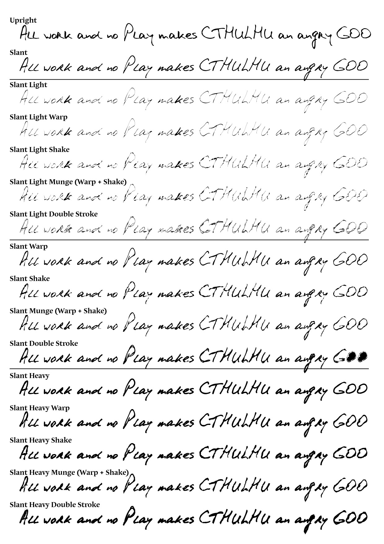
Before I got to creating insane handwriting, I needed a “sane-looking” font which represented the writer in a normal (sane and emotionally-balanced) state. I cruised over to dafont.com and found an excellent free handwriting font called PhontPhreak’s Handwriting. I used two variants of this font to represent “normality” — the first is a fully-upright version.

Font of All Madness - Journal Sample 1and the second is a slanted version.

Font of All Madness - Journal Sample 2[Click images for larger versions]

Slanted handwriting always suggests (to me, anyway) a degree of urgency … like the writer is under some kind of pressure. So I thought that could represent a base-line of emotional duress from which to begin a descent into fonty madness.

Now, there are obviously many ways to convey insanity through writing in a prop. The mental conflict of the writer might make them angry or desperate, which might be conveyed through heavier strokes and bolder letters. Equally, the stresses of encountering something terrible might make someone nervous and frail, which could be suggested through a lighter more wispish handwriting. In order to allow for either option, I started off by making a lighter and heavier version of the slanted font.

Font of All Madness - Journal Samples 3+4[Click image for a larger version]

These I figure might be useful (in isolation or together with the base font) to document the earliest steps down the road to madness.

Armed with these I started playing around with manipulating the shapes of the letters. I did this in two main ways — firstly by warping the glyphs using a wavy-shaped envelope. That gives a kind of overall impression that the writer is struggling to make the normal letter shapes due to a “disturbed” state. The other distortion I tried involved adding in lots of extra points around the glyphs and randomly jittering them around. This gives a “shaky” effect, like the writers hand is unsteady. The samples below show what these look like for light, medium and heavy versions of the font. Most of the text is distorted by the “wave” effect; the bits circled in red are treated with the “shaky” effect, and the sections circled in purple have both effects applied.

Font of All Madness - Journal Samples 5+6+7[Click image for a larger version]

Each manipulation of the base font produces a new font in the broader “family” … so already by this stage there are over a dozen different but related fonts. Conceivably these could be mixed and matched in lots of different ways to make all sorts of different versions of the inevitably decline into drooling idiot.

One last thing I tried was to overlay a couple of these different variant glyph-shapes to create a “doubled-up” effect. Lots of fonts which aim to convey a “psycho killer” slash “Jack the Ripper” kind of vibe seem to obsess on the notion that a madman (or madwoman) would write the same letters multiple times on top of each other. Overlaying the earlier fonts kind of gives that effect. The samples below show this for the light, medium and heavy version of the font family.

Font of All Madness - Journal Samples 8+9+10[Click image for a larger version]

That’s where my experiment stopped … By the time all the different combinations of effects and weights had been multiplied out, I had created a family of sixteen variant fonts. Doubtless someone could extend this further, but for me I reckon that would give me a design arsenal to tackle lots of different props. Below is a contact sheet showing all the fonts, and below THAT some download links you can click to get the fonts themselves.

Font of All Madness - Contact Sheet[Click image for a larger version]

Downloads

The original font used as the basis of this experiment, PhontPhreak’s Handwriting can be downloaded from daFont.com and is free for personal OR commercial use. The variant fonts I have created can be downloaded as a ZIP file using the link below and are similarly free for personal or commercial use.

Download the Font of All Madness family (based on PhontPhreak’s Handwriting)

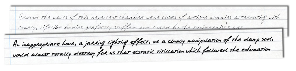
Download the journal sample in full, as a JPG


Finding Old Newspapers

I have mentioned before how I go to sometimes ridiculous lengths to undertake research in the interests of producing Lovecraftian props/handouts for scenarios. My goal in creating such things is always to make something that looks entirely authentic … and the only way to do that is to find out what authentic looks like.

Pie Floater Mystery-extract

The most common type of prop I have made for games is unquestionably the humble newspaper article. After all, what Call of Cthulhu (or even Trail of Cthulhu) story is complete without at least one curious clue hidden away in a musty old newspaper morgue? Making such props is certainly fun … but making them authenic is always a challenge.

As mentioned in a recent post, one of the ways I tackle this task is by trying to find a suitable “reference example” whose style — whether that be typographic style, or writing style, or both — I can emulate. If my task is to create a faux newspaper from 1920s Florida, I will try to find something as close as possible to be my reference example. Once upon a time this would have been very difficult — with the Internet it is MUCH easier.

squamous - devil worshippers

Over the past decade or so there have been several large-scale efforts to scan old newspapers (and usually to OCR them to produce searchable text). My personal favourite such archive is the Google News Archive. I like it for a couple of reasons: first, it’s free. Second, it’s huge — it includes literally millions of pages of scanned newspapers, comprising issues of over 2000 different periodicals.

But there are things that make the Google News Archive hard to use … not least the fact that in 2011 Google discontinued the project completely and have buried it away where few folks are likely to ever find it without help. The other major challenge is figuring out where in the world (or more realistically, North America, mostly) each of the 2000+ newspaper titles hails from. The main index page simply lists the title of each newspaper, the number of issues held in the archive and the (sometimes erroneous) first and last dates held. There’s nothing to help you know whether the “Rochester Evening Herald”, for example, is from Rochester, NY or Rochester, IN or Rochester, PA — indeed newspapers from all three Rochesters are included in the list, none of them placed geographically.

Rochester, PA, courtesy of epodunk.com; I’m sure Rochester, IN and Rochester, NY look completely different

So … what’s a prop-maker to do when searching for newspapers from a specific region to serve as “representative examples” for a design?

Well … one solution is just to use guesswork … but a better method is to produce a geographical index of your own. Over the past week or so, this is exactly what I’ve created for all newspapers in the Google News Archive which contain at least one issue printed in the 1920s. Now, scanning by hand through 2000+ newspapers sounds like a lot of work … but some clever filtering cut the size of the problem down to something more tractable. In the end it really only took a few days to visually inspect a page from every newspaper likely to have a 1920s issue …

In the end, my trawl over the (current) Google News Archive found 319 newspapers which were included with at least one 1920s issue; these were printed in 193 different cities/towns. Most newspapers came from the US or Canada, but there were a handful of titles from Australia (Sydney and Melbourne) and the UK (London and Glasgow). Plotting out these newspapers on a custom Google Map produces a nice geographic index of places for which scanned twenties newspapers are available — the pic below gives a static shot of part of the map; click that image to go to the shared map. Alternatively you can just click here.

Google Map

[ Note that this map is hosted and delivered by Google — some browsers seem to struggle a little displaying the pages served up by the google map engine; if things aren’t displaying correctly for you, try a different browser or read the help pages on Google’s site ]

If you fly around the interactive map and zoom in on specific locations you will see that some cities have multiple markers, one for each newspaper in the Google News Archive printed in that city. Clicking on any marker shows you the name of the newspaper and, more importantly, a link to the scans of that specific periodical. I hope that this geo-index is helpful to prop-makers generally, and particularly folks who have at some time been stumped while trying to find regional data (specifically, 1920s things — the index says nothing about papers published in other decades) in Google’s tantalizing yet poorly-indexed collection of scans.


Anatomy of a Newspaper Prop

As most readers of Cthulhu Reborn would be well aware, I really like the idea of creating realistic-looking props to enhance the play of Lovecraftian roleplaying games (heck, I even published a product to make it easier for people to make nice-looking 1920s newspaper props for just this purpose).

The other day I had the enjoyable experience of running the most venerable and often played Call of Cthulhu scenario — The Haunting — for a brand new gamer. It was, as always, a lot of fun. But while running the game I realized that despite there being several places in the scenario which incorporate clues from newspapers, town records, and the like … none of them are provided in the book as props.

After I finished the game, I googled around to see if anyone had every thought to create such items — it turns out that back in 2008 (and again in 2010) some folks over on Yog-Sothoth.com took on the task of putting together some nifty newspaper handouts. The guilty parties were Greg Phillips, Andy Miller, Alicorn, Andrew Brehaut and Matt Wilson and you can grab a PDF of their cool designs from the vaults of Yog-Sothoth.com.

Now these are pretty neat designs which incorporate some interpretation of scenarios details to flesh out the scenario’s sketchy details (e.g., the scenario says the House is in Boston, but never gives a street address or even neighborhood). To be perfectly honest I would be more than happy to use these handouts when playing The Haunting next time … but while looking through them I couldn’t help but wonder whether some of the older newspapers couldn’t be made still *more* realistic with a bit of historical research and judicious art design.

Fast forward a day or so … and my own experiments to create a period-specific design for the very earliest of the newspaper clues (from a Boston newspaper, dated 1835) were complete. Here’s a photo of the end result, printed out on the cheapest and nastiest paper I could find.

Haunting1835-PrintedIf you’d like to get the PDF of this two-sided design, feel free to click the download link below and you will have it. As with Yog-Sothoth.com design upon which this is partially based, this version of the 1835 handout is released under a creative commons licence.

Download the two-sided 1835 newspaper handout prop for “The Haunting”

Designing the 1835 Newspaper Prop

Now, while posting this design here is perhaps of slight interest to folks planning on running “The Haunting” in future … I thought this would be a great opportunity to show step-by-step how such a design gets created from scratch, sharing some of the tips & tricks that I have learned from making dozens of such prop Newspaper designs. Creating beautiful period prop designs is actually less work than most people would imagine … it’s all about knowing where to look for good source examples and design elements, and knowing what techniques mimic period design and typesetting practices/technology.

[A small disclaimer: while I will step through all the steps to create the design shown above, I am not going to go step-by-step through everything in terms of particular options or features of drawing software. For the record, everything shown here was created in Adobe Illustrator … although probably could have also been done in PhotoShop with some judicious choices. The same features that I’ve used from these products are almost certainly available in other packages as well; but you’ll need to figure that out for yourself if you want to emulate this process]

Courtesy: Cisticola at DeviantART

Step 1: Research

The first step in making something that looks authentic to a period … is to find out what “authentic” means by finding an example or two. For newspapers this is remarkably easy these days. There are loads of archival scans of old newspaper issues, many of them available for free. My favourite place to go trawling is Google News archives — this (discontinued?) service archives over 2000 newspapers of US and Canadian origin, dating back to 1738.

For this project I was interested in finding a newspaper published as close as possible to 1835 in a place as close as possible to Boston. Without going through the gory details, I looked over several candidates before settling on the Rhode Island Republican (which Google archives from 1801 to 1841 with 50 issues from 1835). While I would have preferred a Boston paper rather than one published in Newport, the survey that I’d done convinced me that this would be a good representative anyway.

Click Images for Enlarged Versions (which show much more detail)

Haunting1835-RI Republican 1

The first points I noted when looking through some issues of the Rhode Island Republican were:

  • It’s very much a “wall of text” kind of layout, broken up by a few simple icon graphics but nothing more elaborate
  • It doesn’t really have big screaming headlines with bold fonts; indeed headlines are in the same font as the body, just slightly larger and bolder

Haunting1835-RI Republican 2

The sections towards the back of the (4-page) newspaper seem to hold the advertisements, as pictured above. These aren’t very elaborate from a typesetting perspective but seem to involve the only major difference in font: the drop caps used at the beginning of the advertisments depart somewhat from the otherwise boring and “sensible” typography, being more ornamental.

Step 2: Picking Fonts

One of the most important choices to be made when making these kinds of layouts is deciding on fonts to use. Ideally I try to pick things as close as possible to the source material, although that can sometimes be quite difficult. One tool I’ve found that helps is the website Identifont, which goes through an adaptive Q&A process to identify a font based on its combination of key features. Using this site I found a dozen or so named fonts that could serve as a representative of the body text — looking though my old font CDROMs I found that I had access to a version one of them: Scotch Text.

I followed a similar process on the ornamental drop caps in the advertisements (harder, since there are fewer letter samples — though Identifont has a special “limited characters” option that guides the search using only the letters available). It became obvious that these were some form of Bodoni font.

Haunting1835-Prop1Armed with these fonts, it’s a simple matter to take the text from the Yog-Sothoth version of the handout and render them using these fonts (see above).

Now, even by itself that looks pretty good, but one thing that stands out is that the letters look very crisp … which isn’t surprising since that’s one of the goals of modern fontography and typesetting. But something more smudgy would look closer to the 1835 samples. I’ve found through experience that it’s possible to significantly reduce the crispness of text either through blurring (a fairly crude weapon) or by adding a stroke to the outside of the lettering.

The samples below show the same text with a 0.5pt or 0.75pt stroke applied to the text. As you can see, this makes the handout sample text look much less crisp.

Haunting1835-Prop2Step 3: Placing it in a Page

I always like wherever possible to put some “context” around a prop by typesetting other parts of the page (or book) that they came from. The Yog-Sothoth version of the 1835 newspaper already included a bunch of excellent “context” articles around the “WEBBER HOUSE SOLD” clue-text … so I though I would add those into the layout. But I also wanted to add some other items inspired from the Rhode Island Republican as well … like this advertisement for a “House to Let”.

Haunting1835-Prop3Placing the articles and advertisements into columns, it doesn’t take long before a full-page handout is constructed.

Haunting1835-Prop4Step 4: Creating a Reverse Side

For newspapers I think it’s always a nice touch to print clippings with some additional “context” detail on the reverse side. This is particularly useful when the prop is to be printed on low-grade paper like newsprint. In that case, the reverse side is often visible “bleeing through” indistinctly behind the main design. This gives a nicely authentic appearance.

After clipping the front side design to a rectangular region, I created a second “page” of the design to the right and copied that rectangular region (plus the vertical column lines) over onto that page. With a bit of care (or some basic maths) it’s pretty easy to position the reverse side material at exactly the location that will be behind the front-side of the design when printed in duplex.

Haunting1835-Prop5After filling in more news articles on the reverse side, I decided to stress the printed text and lines on both sides by introducing some grainy blotches which make small sections opaque. This simulates dust and other matter on the printing press that cause ink to be unevenly applied to paper, as well as worn-out metal type. I won’t go into the specific technique I use for this (since it’s specific to Adobe products — basically involving the Mezzotint filter and opacity masks), but any option that lets you knock out random or localised clustered sections would work ok. If you click the above sample to see it scaled up, you’ll see some of the grainy artifacts that this technique introduces.

Step 5: Adding a Paper Texture

Finally, I added some background texture by placing an image of some old paper behind the design and making all the text, lines and icon illustrations slightly transparent (multiply at 95% opacity works well). The end result looks like this:

Haunting1835-Prop6So, anyway, that’s my little experiment with making a newspaper prop from 1835 New England … I’m pretty happy with the result, but even more happy to share some “behind the scenes” info on how it was created. I hope that someone out there will find this info helpful to their own prop projects!


Mutable Deceptions, Vol 1 Now For Sale

Mutable Deceptions 1 - Front Cover (lo-res)Its a big day for those of us here at Cthulhu Reborn … our first-ever commercial PDF product (Mutable Deceptions, Volume 1 – Jazz Age Newspapers) has just been released. It’s available for sale at both the RPGNow and DrivethruRPG online stores.

I’ve already written a bit of a blurb about this product back when it was announced on 9 January … so feel free to jump back to that previous posting if you want the basic info on what it’s all about.

Essentially, though, the idea is that for a modest investment (US$5.95) you get a collection of fourteen double-sided templates for 1920s/1930s news articles. Each is formatted with fonts and layout which give them the right look & feel for the era (and come pre-populated with weird and wonderful real-world articles from the period). Surrounding the main article there’s clips from other news items, period advertisements and other newspaper junk from the era. The same is true for the reverse-side of each article template which features loads of additional period-colour.

You can use these templates to make as many different newspaper props as you’d like … and you can save your modified templates for later use.

So How Would I Use This?

How might someone use such a thing? Well I guess that’s largely up to the initiative and creativity of the gaming public (and there is a LOT of both), but I can easily imagine these templates being handy in these situations:

  • You have written a new homebrew scenario that you’d like some nice handouts for;
  • You have a published scenario but don’t like the look of its props;
  • You’ve modified a published scenario and now need some of the facts modified in its handouts;
  • You are an evil referee who likes making things difficult for your players by adding “red herring” clues to vex them;
  • During play the characters do something noteworthy (aka blow up something) that is newsworthy …

It’s worth mentioning that there really isn’t anything about the newspaper templates that limits them to only being useful for Lovecraftian roleplaying (which, to be fair, uses a LOT of newspaper clues). If you play other games set in the 1920s or 1930s — maybe gangster or pulp games or weird alternative reality games — these would also be useful for such a game. And if you run a modern game which includes old newspaper articles as props or clues (e.g., the recently-discovered contents of Al Capone’s newspaper clipping archive), then they might be useful for that too!

Mutable Deceptions 1 - Arrangement (lo-res)

Supporting Material

Generally, Mutable Deceptions Vol 1 is a self-contained package that includes everything you need to get going (well, except for the Adobe Reader software, but you can get that free from Adobe for most modern OS-es). But I have also put together a “product support” page which has extra stuff that might be helpful to prop-makers or other folks curious about Mutable Deceptions generally.

At the moment this includes a download link for all the (free) fonts which were used to make these highly-authentic newspaper articles … and a higher-res version of the full 12-page instruction booklet that comes with the package. If you want to know what you can (and can’t) do with the product, downloading the latter might help you decide if it’s for you.

Make Amusing Headlines!

Finally, I’ll leave you with some humour from one of the testers who we asked to put the newspaper templates through their paces before publication. Reanimator, indeed!

Mutable Deception 1 - Badger edits


Squamous But True: Car Crash

Newspapers seems to delight in showing us pictures of the carnage caused by road accidents. These days it’s horrors of mangled metal that barely resemble a vehicle. In 1930, the same photo looked like this:

Exhibit B: Milwaukie Car Crash, April 1930

SBT Photo - Fatal Car Crash

One person was killed in this two-car collision (a passenger in the other vehicle). Five other people were injured.

Not to diminish fromthis 70+ year old tragedy … but, I figure there are any number of different ways this photo could be re-used in a Lovecraftian RPG scenario. Who knows, maybe *this* is what your shiny new automobile would like like after it had come off second best in an encounter with a Dark Young of Shub-Niggurath … (“after horror collision with tree, it was only the tree that walked away.”)


Squamous But True #1

So, I am currently working on a project to produce a range of nifty templates that will help Keepers (or other prop-obsessed folks) easily create realistic-looking 1920s/1930s newspaper articles. Hopefully I will be in a position to announce more about this on the blog soon.

Anyway, one important aspect of this project has been a mountain-load of research. After all, there’s no point me claiming things are “realistic-looking” if I haven’t done the hard yards to survey the broad ranges of typography and writing styles used in actual period articles. Fortunately there is a wealth of research material readily available these days … so there’s plenty of samples to look at. That is both a good and bad thing (as my weary eye-balls will attest).

One thing that I always find entertaining when going back to read through real newspapers of the 1920s is the language used in articles and … well … the way that a whole bunch of news is reported in such hysterical and quirky ways that the real-world articles SOUND like they should be part of a Lovecraftian horror scenario.

I thought it might be fun to share some of the weirdest and most Lovecraftian examples here on the blog. Feel free to use these odd-ball articles to inspire scenarios, form baffling red herrings to fool your investigators, or simply fill out police case files bursting with reports of weird happenings. Or you could just laugh at the way folks of yesteryear saw the world.

Exhibit A: from several news sources, January 1929

Six Murder Mysteries In One Family

Doctor Accused of Slaying Wife Relies on Baffling Chain of Crimes to Prove His Innocence and Win Freedom

Olathe, Kas. — A mysterious curse that brought death to six members of one family in the course of a third of a century is cited by Dr. S. C. Netherton, retired Olathe physician, as the real reason for the murder of his wife nearly two years ago.

And on this strange explanation, unsatisfactory as the courts thus far have found it, Dr. Netherton bases his hope of being freed from serving the rest of his life in prison.

He was convicted some months ago of the murder of his wife, and is now waiting for the Kansas supreme court to pass on his appeal. His appeal is based on his denial of guilt and his suggestion that the weird, unexplained curse that, he says, hung over his wife’s family, was responsible for her death.

Now he says he fears for the life of his 9-year-old daughter, Dorothy.

“I’m afraid she is the next on the murderer’s list,” he says. “If I go to prison, she will be left to the mercy of those who appear bent on wiping out my wife’s family.”

A graduate of Johns Hopkins University and a world traveler, Dr. Netherton retired on a suburban farm here with his wife a decade ago. Mrs. Netherton was well-to-do; she possessed property worth $100,000, but none of the neighbors ever suspected it. The Nethertons lived frugally. The only money they ever spent for anything except actual necessities went to buy dresses and toys for little Dorothy.

In February of 1927, Mrs. Netherton was found, shot to death, in the basement of their home. The bullet had come from behind.

Circumstantial evidence pointed to Dr. Netherton and he was arrested and brought to trial. He insisted he had been in town at the time of the murder, but was unable to prove it. His attorneys tried to bring into court the tale of the previous murders in Mrs. Netherton’s family, but the judge would not admit the evidence. Dr. Netherton was convicted.

Dr. Netherton admits that he is unable to explain the strange chain of killings. He firmly believes that some person or persons have followed his wife’s family for years, trying to wipe it out of existence, but why this is being done he has no idea. At any rate, here is his list of the crimes:

In 1882 Dode Strahl, a trapper, and a nephew of Mrs. Netherton’s mother, was shot to death near Deadwood, S. D.

A few years later Roll Strahl, Dode’s brother, was found shot to death in a farm wagon at Exira, Iowa.

The same year, Colbert Strahl, father of the two slain men, was shot to death while riding on his horse from the town of Exira to his farm.

In 1916 Arthur Strahl, a first cousin of Mrs. Netherton, was shot to death in Chicago.

Four years later Paxton Muir, a second cousin of Mrs. Netherton, was found murdered in a Los Angeles hotel.

No arrests were ever made in any of these murders.

It is upon this story that Dr. Netherton depends to save him from serving the life sentence to which he has been sentenced.


Distressing Documents

It’s funny the huge variety of different visual styles people ask me to try to emulate in Call of Cthulhu handouts. I thought the weird and wonderful concepts I come up with for my own book projects here on Cthulhu Reborn were bad enough … but it turns out the folks who do this professionally dream up even stranger and more ambitious ideas they would like realised as handouts.

As a case in point: I recently started working on handouts for a forthcoming book from Sixtystone Press called “Ghouls — Eaters of the Dead” (written by Dan Harms). There are quite a lot of handouts for this book, ranging from things that are very old to things that are very modern. Turns out both are challenging in different ways.

One of the tasks I tackled the other day was the design of an official-looking government dossier, laser printed and much-photocopied. The final product looked a bit like the picture below (although you will need to buy the Sixtystone book when it comes out to see the actual layout in its complete glory with actual text).

This particular design is a fairly extreme example of something that I do quite a bit … which is taking something that is nice and clean and distressing it mercilessly until it looks lo-fi and grungy. I thought some folks might be intrigued by a walkthrough of how this kind of effect is achieved.

For this particular piece I started out with something very mundane, namely a Microsoft Word document with the kind of extremely clunky and basic formatting that is typical of official government reports and documents. In real life these reports use the blandest and most default fonts and templates they can … so here I just decided to type up everything in Arial and judiciously bold a few titles, but not to try to do anything fancy. Then I printed out the page, scrunched up the paper, punched holes in the side, scribbled on it and stuck some staples in it. Then I slapped it on my scanner at a jaunty angle and scanned the page back in as a bitmap. [Aside: I’ve never figured out why, but the real-world guys who photocopy official government documents seem to *really* not care about whether they are straight or not. I figure it isn’t an artistic statement.]

The left hand figure below shows what the raw scanned-in picture looks like (click any of these images for a larger copy):

The basic scanned in picture looks ok … but it’s way too clean. First stop is Adobe Photoshop’s built-in “Photocopy” filter. It lives in the “Filter” menu under the “Sketch” category and is quite a nifty filter in its own right. It’s worth tweaking its two sliders to see what kinds of effects you can get … but a sort of typical result is the right hand figure above. Note that a lot of dirt has come out as well as a bit of bleed through of smudged-up stuff from the reverse side of the page.

This is pretty good, but it would be nice to mess it up a bit more. One of my favourite ways to distress documents in Photoshop is with the Mezzotint filter. It lives in the “Filter” menu under the “Pixelate” category. It basically adds different types of random messiness, whether it be grainy dots or random horizontal line segments. The figure below shows the result of adding some “Long Strokes” — see the noisy background of grainy lines which seems to cover the page background.

As well as messing around with the image via filters, another great way of adding distress is via overlaying textures. I went onto Google Image search and looked around for a while to find a few “Photocopy Textures” which were available as freeware downloads (there are a lot that are commercial stock images, but there are nice people out there in Internet-land that create these types of things for free download too). The picture below shows the result of overlaying the document with a separate Photoshop layer containing one of these textures. This is a semi-transparent layer — I set the blend mode to “Darken” and the opacity to 45% (values picked as the result of visual experimentation).

Finally, I picked another of the freeware “Photocopy Textures” and placed it on a fresh Photoshop layer that sits *below* the image of the scanned page. The idea here is that I wanted the text of the report to kind of blend into the texture of the photocopied page. This meant making the page layer semi-transparent — I picked an opacity of 72% and a blend mode of “Hard Mix” and this was the result:

Now, I guess that’s not the world’s tidiest picture of a report page and maybe not the easiest to read … but that’s kinda the point. It definitely looks like the kind of thing you’d see on some dodgy conspiracy theory website or site for government leaks … and let’s face it, those are the sorts of places Call of Cthulhu investigators are going to go looking for official information …

BTW: for those that are curious — the folded page effect shown in the picture at the very top of this post wasn’t actually created in Photoshop but using another tool: AutoFX DreamSuite.


Humanizing Handwriting

Cthulhu Reborn has been getting quite a bit of additional traffic over the past few days thanks to it being mentioned, initially over on the rpg.net forums, but then over on the dark-king-of-all-Lovecraftian-blogs, the excellent Propnomicon (how cool!). The source of this unexpected interest is … well, something quite simple really: the blank Essex County autopsy form I posted here back in December.

As mentioned previously, this form was something I created for a series of scenario handouts for a huge and prop-heavy Call of Cthulhu adventure I’m still only part-way through typesetting and designing on behalf of a (fairly well-known) CoC author. So … while it will probably be a while more before the final book/PDF is complete, I thought it might be kinda neat to share one example of what *I* have done with the Essex County Autopsy form:

Some Thoughts on Handwriting Fonts

Revisiting this design reminded me of all the work that goes into trying to emulate real-world handwriting. Why is that? Surely there must be some good handwriting fonts out there that will do the job out-of-the-box? Well … I guess it comes down to exactly how realistic a look you are going for. Now … I like handwriting fonts as much as the next person (although they give me lots of headaches). Some of them are even pretty good approximations of letter-shapes that mimic the way people really write. But, with the vast majority of text set with these fonts if you look closely at the regularity of the letter-shapes upon repetition, the crisp straight baselines from computer typesetting, and the regularity of character spacing … all these things make passages look not-quite-human.

To demonstrate what I mean, and some of the tricks I have learned to try to “humanize” text formatted using handwriting fonts (used in the above prop), here’s a simple example. The message below is formatted using the excellent HPL Historical Society font based on the cursive handwriting of H.P. Lovecraft.

Now, that’s a great font … and even straight out-of-the-box it looks pretty reasonable as a simulation of human handwriting. But … if you look closer, you’ll notice a few things. The capital I character repeated in both lines looks exactly the same in both renditions. The lower-case T is also conspicuously identical in angle and weight in each of the half-dozen places it appears. And the baseline is dead-straight, much moreso than a real person would create. Now, none of these are failings of the font itself (most fonts only include one version of the upper-case I glyph for example), and for short passages of faux-handwritten text they are probably fine. But when you’re putting together long passages using a font like this, the repetition and regularity of the font definitely dimishes the overall illusion of the text having been written by hand.

So, what can you do about it? Well, I’ve experimented with a range of things over the past year or so, searching for ways to “humanize” the typeset text by introducing effects which emulate the natural irregularities and variations human beings apply when writing.

A simple technique that gets you a long way is simply selecting small groups of letters (and/or spacing) at random and tweaking their character height, then independently making a second pass of picking out short sequences of letters and tweaking their character width. Some letters will get tweaked both ways, some along one axis, but not the other, and some parts not at all.

Below is the result of this method applied (in Adobe Illustrat0r) to the text above. Some groups of characters have had their height tweaked by various different factors from -25% to +50%; widths have been tweaked in the +/- 25% range for some passages.

So what has this achieved? Well, look at the two upper-case I’s — they now have a similar, but not identical shape, angle and weight. Similarly, compare the various renditions of the lower-case T: each has a slightly different angle and size. Compare, for example, the ‘t’ in “writing” with the one which follows in “this” … they look similar, but quite obviously not the same.

Another trick that I’ve used is to apply a similar approach to randomly tweaking character spacing (tracking, to be technical). The passage shown below is the result of taking the preceding text, selecting sections and modifying the tracking by various values in the -50 to +50 range.

If you look closely, you’ll see how this has made some words look more cramped-looking (e.g., “appreciable”), while others are more spaced-out (“be no more”). This is fairly subtle, but it definitely enhances the varied look of the text and (I think) more accurately simulates the inconsistent spacing that people apply when writing.

Using Envelope Distortion

For a long time, the two methods described above were the bulk of what I did to try to make handwritten text look “realistic”. More recently, though, I have added another tool to my arsenal: using Adobe Illustrator’s “Envelope Distort” function. Without going into any detail at all, basically what this lets you do is to distort an object according to the shape of a different object. How does this help? Well … if you draw a non-filled rectangular path around each line of text (but on top of it):

it’s then fairly easy to “roughen up” this rectangle by hand. The easiest way in Illustrator is just to select the rectangle, pick the Pencil tool and start drawing close to the edge of the rectangle. Drawing like this edits the path, so if you trace around the four sides of the rectangle using the mouse (or a tablet), you end up with something that is rectangle-like, but not perfectly straight:

From there, all you need to do is select the first line of text and the corresponding pseudo-rectangle, click on the Object menu, select “Envelope Distort” and then “Make with Top Object”. Repeat for line two, and you have:

Note how the various renditions of the same letter now have quite different shapes, weights and spacing. In particular, compare the two capital I’s. Also, the baseline is also not perfectly straight and looks a lot more like what a person would do if trying to write in a straight line. Obviously, experimenting with different amounts of envelope tweaking is a good idea, since extreme deviations from the original rectangle generate things that just look weird.

Now … doing all this for a largish passage of text is pretty time consuming, particularly because it’s best to use slightly different settings / envelopes for each line of text (which means mixing it up differently each time … or at least being selective when it comes to reusing things). That’s why props like the filled-in Autopsy Report above take quite a bit of time to create. Is it worth it? Well, ultimately it comes down to how realistic you want something to look and how well your eyes can pick fake computerized “handwriting”. Problem is … once you start looking closely, you start finding fault with more and more examples of apparently realistically rendered writing …


Rites of Solstice

Well, it’s been a while since I posted an update on Cthulhu Reborn, but that doesn’t mean that I haven’t been busily working away on a variety of different Call of Cthulhu projects. It just means that I haven’t quite managed to entirely finish any of them off. Hopefully early in the New Year, some finished goodies will appear here for all to download and enjoy.

In the meantime, imbued with the spirit of the season, I thought I would share a couple designs for Cthulhu props and handouts from projects that are still in progress . Given the nature of your typical Cthulhu prop/handout, though, I’m not sure that any these “gifts” are particularly filled with Xmas Cheer. Maybe if you use your imagination 🙂

Essex Count Autopsy Form

You don’t have to run many Cthulhu scenarios set in Lovecraft Country before you start having a need for a prop form describing an autopsy conducted by the Essex County Medical Examiner. Most of the core of fictional Lovecraft Country (in particular Arkham, Kingsport and Innsmouth) lie within the real-world Essex County of Massachusetts … so its the unfortunate authorities from that part of the world who get to investigate the somewhat-higher-than-average rate of bizarre murders and attacks by animals which seem to bear no relationship to any known species.

One of the projects I’m working on is a prop-heavy mini-campaign set in Kingsport … it’s the same one for which I designed the new masthead for the Kingsport Chronicle (which has been getting a LOT of work in my designs over the past couple of months). A few weeks back I had a need to produce a few autopsy reports as props. Since I couldn’t find anything particularly well suited to the task of a 1920’s Massachusetts autopsy prop, I drew my own.

In case you’re wondering where the inspiration for the form design came from … all I’ll say is that one of the main sources was a real autopsy report (albeit from a much later era). I’m not going to say whose autopsy it was … just that cheeseburgers were involved.

I created a couple of different versions of the form (each using a different method for artificially stressing the inked portion to simulate flaws in the 1920s printing process). The version below is the “low stress” version. If you want to see the same form put through the wringer a bit, here’s a more stressed version.

Click on image for larger version

If anybody would like to use these forms as the basis for their own props, please feel free to. Like everything else on Cthulhu Reborn, these designs are provided under a Creative Commons license which means you can do pretty much anything with them except make money.

If you want to derive designs, you might want to grab these high-res versions (which lack paper texture and signature): low stress version, high stress version

Suicide Tableau for Jeff Moeller

A month or so back, over on Yog-Sothoth.com, talented scenario writer Jeff Moeller posted requesting some help with creating a “police photo of a blood stained suicide note” based on a detailed hand-drawn design he had already made in pen. I thought I would take a shot at creating a design for this intriguing mini-project. One of the balancing acts that you always have to perform with things like blood-stained props is deciding how much blobby design grunge you can add (to create a look-and-feel) while still retaining a readable document, which is after all the point of a handout. Looking at Jeff’s scanned up note I was a little concerned that by adding a lot of bloody markings, much of the fine detail of his beautiful design would be lost — so I made a suggestion. Why couldn’t the police photo be of the entire tableau: the note and the desk around it. That way, I could add loads to blood to areas around the note, but keep the central part relatively readable.

Here’s my take on the tableau of a suicide by ritual disembowling. Not a nice way to go IMHO.

Click on image for larger version

In putting together this tableau design, I actually started out with a larger area of the desk — if you want to see this bigger version of the tableau, you can scoot over to this page.

The Arkham Advertiser … as a Website?

For yet another project I am currently working on, I will be called on to produce some modern-day newspaper props for a scenario set in Arkham. One of the things I toyed with was the idea of creating online-looking news articles, i.e., an online visual presence for the venerable Arkham Advertiser. To make such a think look vaguely authentic I figured the best method would be to mock up some HTML, make some dummy images for advertisements, and capture some screens from Firefox or IE. So, that’s what I did for the design below. Truth be told, I’m not sure now whether I’ll use it now … but I guess the layout and images will turn up somewhere in a future project.

Click on image for larger version

That’s It for the Strange Aeon of 2011

Unless some miraculous stars align in the next few days (allowing me to finish one or more scenario PDFs), this will be my last post for 2011. It’s been kind of fun creating free designs and layouts for the past 8 months … here’s hoping I can maintain enough free-time to keep it up in 2012 🙂

Be-tentacled Holidays to all!


Dateline: Kingsport, Mass.

Newspaper articles. Theyr’e the one thing that Call of Cthulhu scenarios seem to never get enough of. Whether it’s the front-page screemer alerting the general populace about some heinous and despicable murder, or the short and subtle clue buried away in a story about a creepy old church being condemned … somewhere along the way, most adventures feature Investigators carefully clipping something out of the local rag. Sometimes I wonder whether veteran CoC characters (if such a thing exists) dedicate entire rooms of their musty old houses just to house the piles of yellowing news clippings that they have accumulated over the years. I don’t even want to think about the fire risk 🙂

When typesetting Cthulhu scenarios, I usually try to put a fair amount of time and effort into making all the handouts / props look good … but, in particular, I always seem to end up spending a lot of time making the (ever-present) newspaper articles look just right for the era. I figure that the players will spend a fair amount of time looking over any handouts they are given (even the red herrings) … and if they *look* like they’re authentic period clippings, that can only reinforce the game’s setting.

I have typeset enough scenarios now that these days I have my own ready-to-go templates for things like “1920s clipping from the Arkham Advertiser”. Things like the excellent HPLHS Props and Fonts CDROM — literally worth its weight in vintage newspapers — help enormously. There are also some excellent resources out on the web for scanned up pages from real period newspapers and magazines, which can be invaluable when trying to track down weird and wonderful advertisements from the twenties (or earlier).

Recently I started some preliminary work for a future project laying out a PDF for an intriguing mini-campaign set in Kingsport, everybody’s favourite ethereal and mist-shrouded corner of Lovecraft Country. Because it features a *lot* of newspaper handouts, I thought it would be worth putting some effort into designing a new template for the local Kingsport newspaper, the “Kingsport Chronicle”. Part of this involves making some decisions about slightly different font choices and idiosyncracies of layout …. but one big part of defining the “identity” of a newspaper is having a nifty graphical masthead from which you can clip out segments to add to the top of supposedly front-page headlines. For my Arkham Advertiser article template, I just use the masthead from the prop newspaper designed by the HPLHS (included on the CDROM) — after all, it looks great and perfectly captures the era. But for my Kingsport template, I would obviously need something different … so I thought I would design it myself.

In looking around for inspiration, I spent a little time looking at various 1920s Massachusetts newspapers. I chanced upon some images of the Marblehead Messenger … which is of particular interest, since it’s generally accepted that Marblehead is the real-world “model” that Lovecraft had in mind when inventing Kingsport. It’s also of particular interest because the Marblehead Messenger has an unusually spiffy looking masthead (pictured below):

Now that’s something I’d be proud to have at the top of my prop handout about the creepy ghost ship found drifting in Kingsport harbour bedecked in glowing green tendrils of goo!

Reproducing the “look and feel” of something as elaborate as this masthead is no mean feat … but I thought I’d give it a go anyway. Starting with an old engraving of Marblehead harbour (liberated from an out-of-copyright book scanned up at archive.org), I spent quite a bit of time trying to track down a font which combines the vaguely black-letter, vaguely art nouveau feel of the ornate letters but also has the slab/block feel for the remaining letter. I found something sort of close and played around with laying text out on a spline path in Illustrator. Finally I pulled down some examples of real newspapers from the era to see what text elements and dividing lines should surround the masthead, and what info boxes should go to the left and right. The result is below:

(click for a larger version)

It’s not quite the same feel as the Marblehead masthead … but I’m pretty happy with the result, and parts of this pic will no doubt appear around the edges of many of my Kingsport-based news clippings from here on in.

In the interests of the Community, and in the give-stuff-away-for-free spirit of this blog, I am more than happy for this design to be used for free by others for non-commercial purposes (under a Creative Commons license). Anybody who wants to write their own Kingsport Chronicle headlines will probably want to grab the higher-resolution version of this pic (minus the yellow-paper effect) available here. If you do something truly creative and intriguing with this picture, I’d love to hear about it! If, after viewing this page, you find your dreams inexplicably plagued with uneasy yet indistinct sensations of antique ships and hypnotically undulating sea weeds … it’s not my fault, honest.